Understanding Web Animation Performance
Categories
Over the past few years, we have seen the web platform evolve rapidly. Many JavaScript APIs, CSS properties, and native elements have been added. Frontend engineers are now able to build web apps that are extremely similar to traditional native applications.
This paradigm shift, from writing documents to building apps, has a clearly implicit increase in complexity: render multiple data sources, handle state changes, display different actions, and more. If we are not careful, interfaces can easily become a mess with a poor user experience.
Animations are a great tool to fix this. Using them properly can improve the experience and add a touch of joy, guiding users through the entire application flow so they can focus on what really matters.
Fortunately, the web has also evolved its animation APIs. From adding new animatable CSS properties, to completely new APIs that can help build complex interactions with little code, WAAPI, scroll-linked interactions, shared element transitions, masks, clip paths, offset paths, and grids – there is an array of new tools available.
Although these more convenient animating methods exist, we still need to be realistic and understand that complex animations are hard to build. It is easy to reach a point where the animation is slow or janky, ruining the experience even more. For frontend engineers, it’s very important to understand how the browser renders the code that is shipped to it.
Rendering Pipeline
An animation is simply a list of multiple images that are shown very fast. In this case, the image is the visual state of the website at a certain point. "Very fast" usually means 60 times per second, but it can be even faster as high frame-rate displays become increasingly common.
Browser rendering is a complex process that consists of four different phases. In this pipeline, the browser takes the HTML and CSS and transforms them into an image which is later shown on screen. The trick to building smooth animations relies on understanding this process, and what happens during each step.
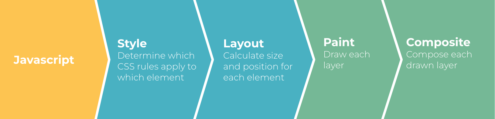
In the first phase, the HTML elements are matched with the CSS that applies to them. This is called the style phase. The browser has to match each DOM element with the rules that apply to it. The more complex the HTML and CSS are, the slower this process will be.
Then, the browser interprets the layout – the overall geometry. Here, for every HTML element, it applies only the CSS properties that affect position and size. Properties like height, width, border-width, margin, padding, and font affect this step.
Once the position and size of each element are known, the browser can apply the rest of the visual styles in the paint phase using properties such as color, box-hadow, background, and border-color.
Finally, it builds the complete image, composing all the different layers in the composite phase. Only a few properties like opacity, transform and z-index or filter affect this phase.
Rendering is a complex process. Normally, a website has hundreds or even thousands of DOM nodes and the same amount of CSS rules. The bigger a website is, the slower this process will be, and that is without taking JavaScript into account. When we animate something, we aim to execute this process at least 60 times per second. That leaves us with less than 16ms to render each frame.
Now that you understand how the browsers render a website, there is one big secret related to performance in every kind of software piece: “doing nothing is faster than doing something.” People who code browsers know this secret, and optimize the rendering process by using it. If the animation only depends on properties that are used in the paint phase, it will skip the layout one. If it only depends on composite properties, it will skip both the layout and paint phases, saving precious milliseconds and computing power.
Measuring the Rendering Pipeline
Many times, we frontend developers can sense which phase will trigger a CSS property, but there still are some that are not clear. Moreover, an effort is being made to make browsers smarter and optimize some of the properties, so that they only trigger the composite phase.
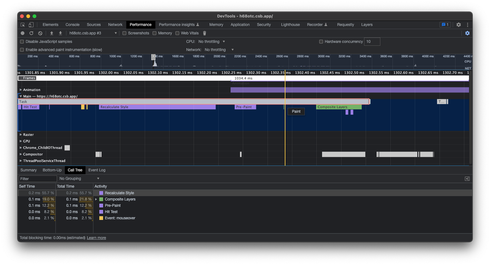
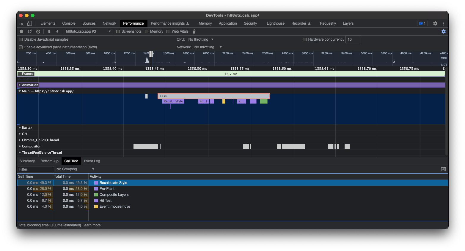
Thankfully, browser devtools make it simple to check which phase affects which property. By recording a performance entry and playing the animation, the phases can be seen once per frame.
On the website below, there are three animations that look exactly the same, but each one uses different CSS properties.
If we change a property such as width or height and check the performance flame chart, we can see the four phases happening: style, layout, paint and composite.
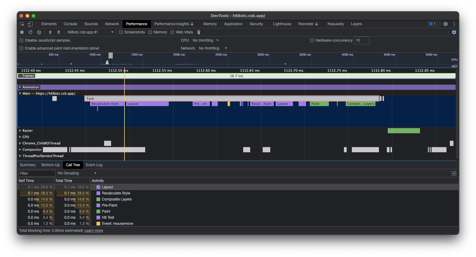
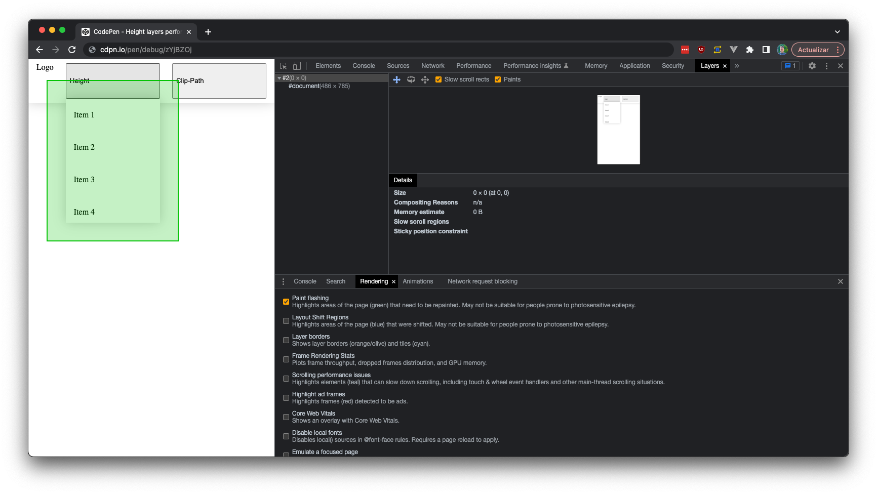
If we toggle a property like clip-path, we won’t see the layout phase. The browser knows this property can’t affect the geometry, so it skips the layout phase and only triggers the paint and composite phases.
Finally, if we toggle a property like transform, we won’t see the layout or the paint phase. The browser knows that the animated element will only change its position, so it avoids calculating its geometry and paint styles, reuses those from the last frame, and moves them onto the screen.
But, if you look carefully at the first and last frame, you will see that there are two paint events. Why does that happen? Isn’t that weird? As it turns out, it is part of the optimization process. Animating a transform property is one of the reasons to create a new layer.

Layers
Browsers can divide the DOM into different layers – different areas or images that are then stitched together in the composite phase. They are smart enough to only repaint a layer when needed, and can even repaint one area of a certain layer, which is called an incremental repaint. We can see this as different cache levels.
To see what exactly is being repainted, the Paint flashing option can be enabled in Chromium browsers. This option is hidden in the Rendering devtools panel. (Don’t see it? Check to ensure the panel is enabled in the More tools menu.)
However, having too many layers is bad, as it implies consuming more memory. While this is not usually an issue in top-notch computers or smartphones, it tends to cause problems for lower-end devices. Moreover, these layers' pixel info has to be sent to the GPU. Layers are great for avoiding repainting certain areas, but they shouldn’t be overused.
There are only a handful of reasons to create a new layer:
- 3D CSS properties, such as
rotateY,rotateZ,translateZ,perspective - Animations of
transformandopacityproperties - Accelerated elements like
videoorcanvas - Siblings with a lower
z-index, which has its own layer - Elements with
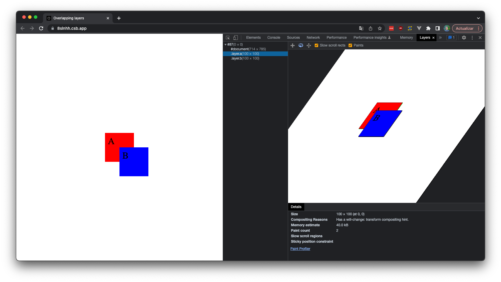
position: fixed - Hints such as
will-change: transformproperty - Elements with the
mix-blend-modeproperty
As you can see, one of the reasons to create a new layer is to start an animation of composite properties. This process is called layer promotion and has two paint events associated, which is why a paint event happened in the first and last frames of the aforementioned example.
Chromium browsers make it really easy to view the current layers from the devtools. Just navigate to the Layers panel and use the real-time 3D inspector. This panel may be hidden by default, but can be enabled from the More tools section. This developer panel has useful information, such as why each layer was created or the number of times it has been repainted.
The more complex a layer is, the more time it will take for the browser to paint it. The amount of DOM nodes, complex CSS selectors, and expensive properties like filters or shadows affect the total rendering time. That’s another reason why it is important to try to keep code as simple as possible.
Joining the layers is a process that happens on the GPU. To do so, the CPU prepares an image of each layer and sends them to the GPU so it can compose them, as it is especially good with this kind of task. Animations that happen in this phase are said to have hardware acceleration, which sounds like...something. But what does it mean, exactly?
Hardware Acceleration
Hardware acceleration is just a term to say that a process runs on the GPU. Animating transform and opacity , or sometimes even filter, happens in the composite phase. Therefore, the browser can reuse the layout and paint information. In other words, the CPU does not have to send new images to the GPU. Instead, the GPU saves and reuses previous images, composing them with different opacity, position, and effects.
Why is this important? Well, sending images to the GPU is not free. We are used to highly compressed images such as JPGs when referring to images, but that compression doesn't exist in this case. An image has one byte of information for each color channel, red, green, blue, and alpha; four channels per pixel in total. Just to render a 100px x 100px image, 40KBs of memory are required. Layers usually overlap, so if there are different layers in the same area, that would amount to 80KBs.
True, we are talking about a very small region. For a good old FullHD resolution layer, it would be 1920px x 1080px * 4bytes/px = 7.9 MB of data. A 4K screen, on the other hand, would require 34MB of memory.
Now, imagine a very bad scenario where two 4K layers have to be composed in a cross-fade animation that lasts one second. The CPU would need to send almost 4GB of information to the GPU in that time. Isn’t that a massive amount of information?
Sure, a good computer can handle it, but according to the latest stats, around 60% of users navigate using an Android or iOS device. These devices have become more powerful and do not suffer as they did just a few years ago – but they still are more prone to crashing when handling all this data. Plus, they usually have passive cooling systems, which can typically make the CPU/GPU throttle to cool off.
Conclusions
Most web animation tutorials out there will tell you only to use transform and opacity in animations, as they are properties that only affect the composite phase and are hardware-accelerated.
By only using these properties, you will be in safe territory and your animations will certainly perform well on any kind of device. But sometimes, other properties that don't perform as well will have to be used. Have no fear! If you understand how rendering works, you can optimize these kinds of animations and reduce the overhead.
There are many tricks out there: using certain CSS properties, like replacing box-shadow with filter: drop-shadow, or using transform instead of left/ right/ top /bottom, leveraging CSS animations with techniques such as FLIP, or layout projection.
Every website is unique, and what works for others doesn’t have to work for you. That’s why the most important thing before solving any problem is understanding its roots. Now, when it comes to website rendering and how it affects animations, you can do just that!